
Background
Expedia's Strategic Partnerships and Affiliates team helped creators monetise travel recommendations through Expedia's affiliate platform. By this point, social media had become one of the primary ways travellers found travel inspiration, and creators were building businesses around it.
Problem
Social platforms had become how travellers discovered where to stay, but they were built for content, not commerce. The average time between discovery and booking was six months, and with creators posting 3 to 5 times a week, recommendations were buried long before travellers were ready to act.
We spoke with 10 travel creators to understand how they monetised recommendations. Across all of them, the same problems emerged.
As recommendations disappeared, direct requests increased
Creators were bombarded with the same questions about old posts. Where did you stay again? Can you send me the link? Every recommendation lived in a post that would eventually disappear, with no scalable way to answer.
The only path to more income was more output
Content creation was relentless, requiring constant planning and coordination. Established creators would hire a small team to manage content and operations. However, the only way to earn more was to produce more, hoping to catch travellers at the right moment.
Task
The core problem was impermanence: recommendations lived in posts that disappeared before travellers were ready to act. That pointed toward a persistent, creator-owned destination outside the feed. The question then became how to make it feel native to how creators already worked, and familiar to travellers already used to browsing social profiles.
I designed an experience where creators could curate hotels into shareable collections and promote their shop as the single place to find all their recommendations. Travellers could be sent there directly, return to it whenever they were ready to book, or discover more from a creator they already trusted.
Solution
I landed on a social-first commerce experience. Creators got their own Shop to curate hotels into themed lists called Collections, a persistent destination they could promote directly and travellers could return to whenever they were ready to act. Rather than surfacing hotel information throughout, I brought it in at the moments travellers were ready to book, keeping the experience closer to browsing than searching.
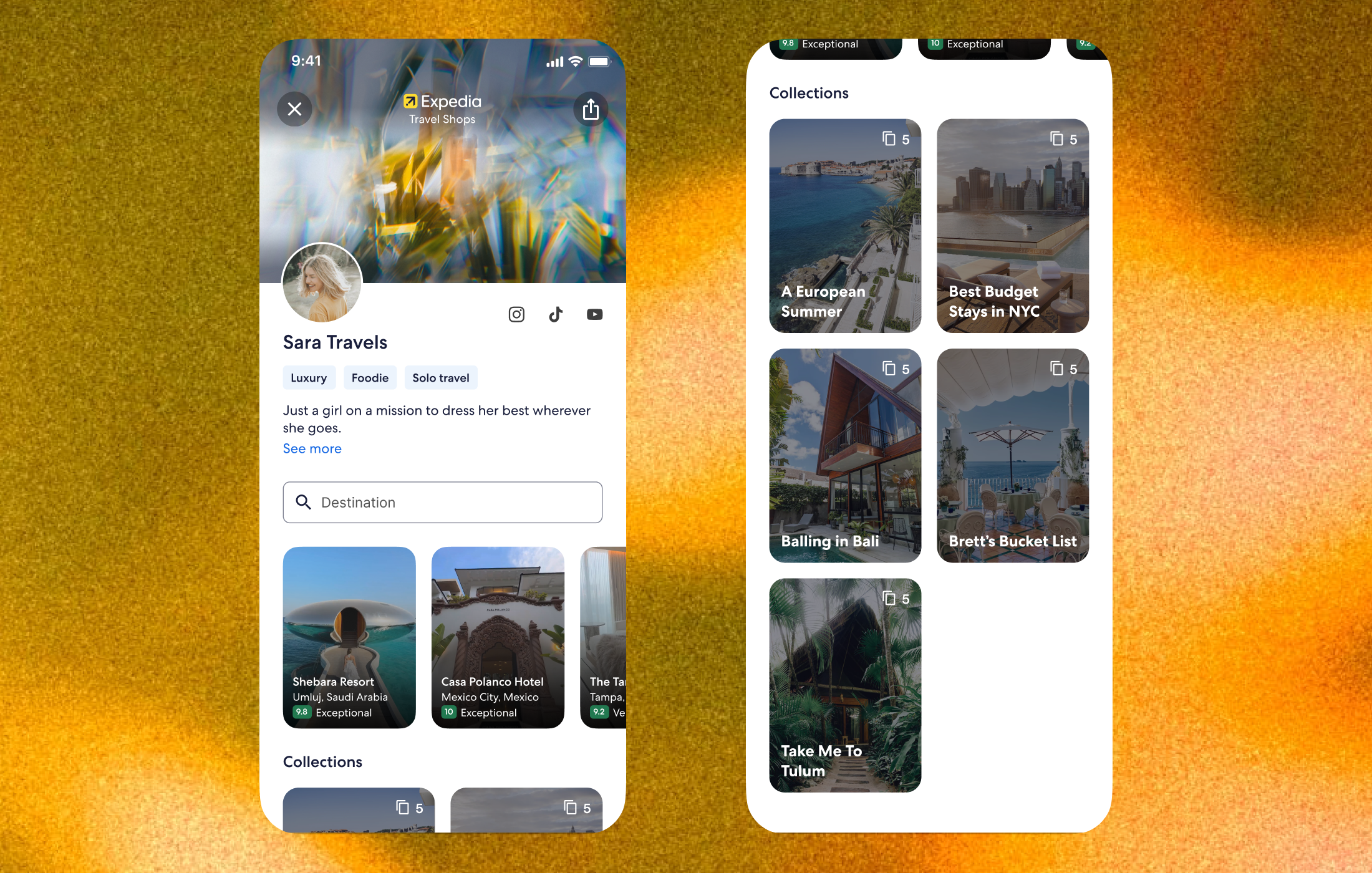
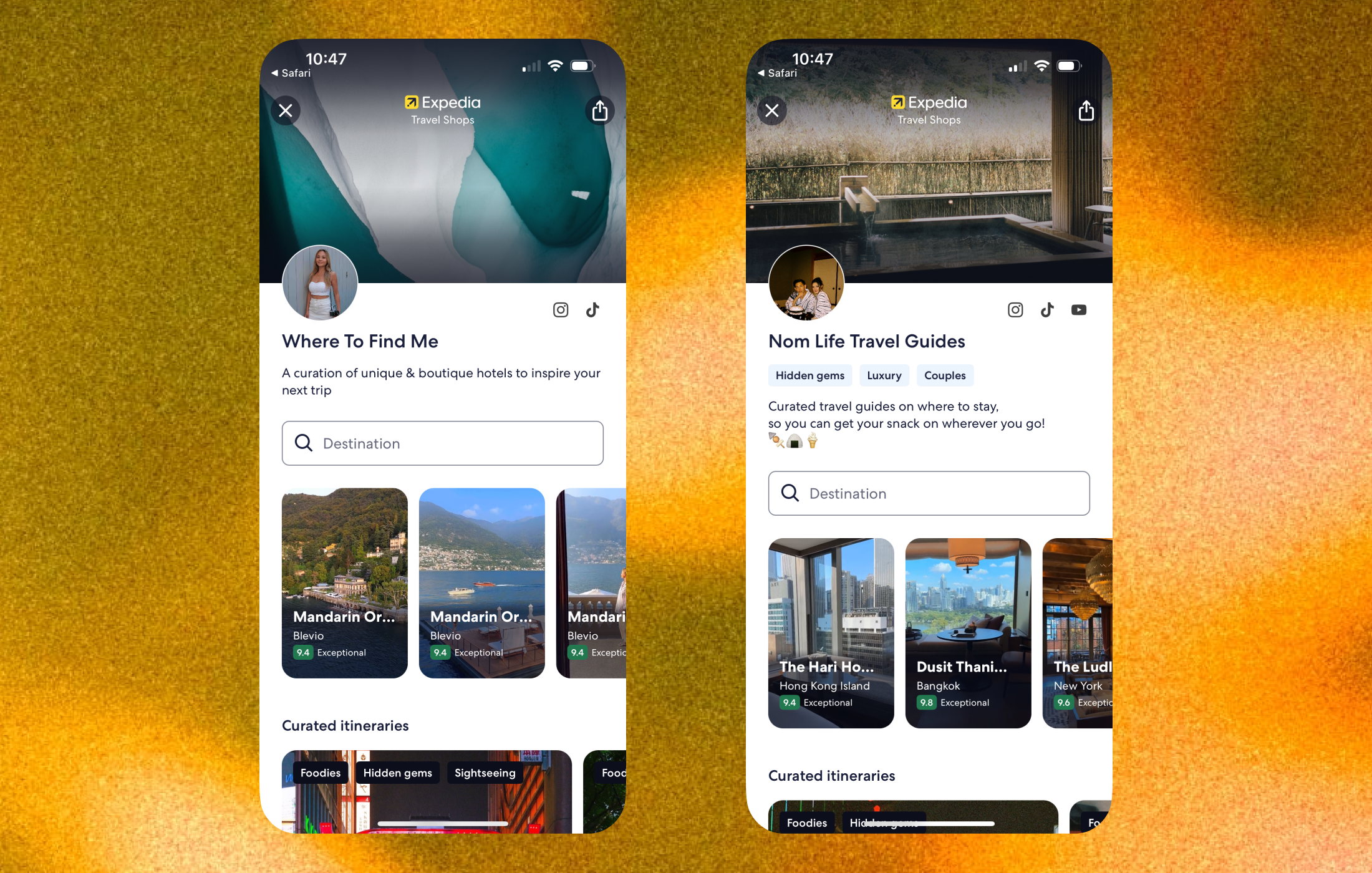
Shop Profile Page
The Shop Profile Page is the creator's storefront. It shows their brand, a short bio, and a grid of Collections, giving travellers a place to browse everything a creator has recommended.
A traditional e-commerce layout, search-forward, filter-heavy, product grids, would have been the wrong tool for the job. Travellers were already discovering travel through social content because it was easier to consume than a search engine. Creators were already fluent in the tools that used these patterns every day. Designing to those familiar structures lowered the barrier to adoption for both.
Social-first vs commerce
I prioritised social-first on the shop page, structuring the information using the same hierarchy as a profile page on Instagram. Research and usability testing showed creators and travellers found the pattern familiar, and given that Travel Shops live within the Expedia shopping experience, travellers already understood the commerce element without it being called out explicitly. Creator preference reinforced this, since a social-first design gave them room to personalise their store.
Personalisation
Creators could personalise their page to match their brand. This added social proof, so travellers recognise their favourite creators when the shop appears across Expedia.
Searchable collections
Collections let creators curate recommendations into themed lists that travellers could browse or search by destination. Each collection card showed the collection name, number of stays, and a hotel image, enough to understand what was inside without opening it.
Shareability
A personalised URL meant creators could promote their shop directly in content and on their social profile. Instead of a recommendation disappearing into a feed, followers had somewhere permanent to go, and creators had a direct answer to every "where did you stay?" question.
Collections
Collections are the themed lists creators use to group their recommendations. Opening one takes travellers into a full-screen view where they can tap through hotels and decide what to explore further.
A list or card grid would have pushed travellers back into a search-like mode: scanning, comparing, evaluating. The full-screen format kept them in the same browsing mindset they arrived with, making discovery feel continuous rather than transactional.
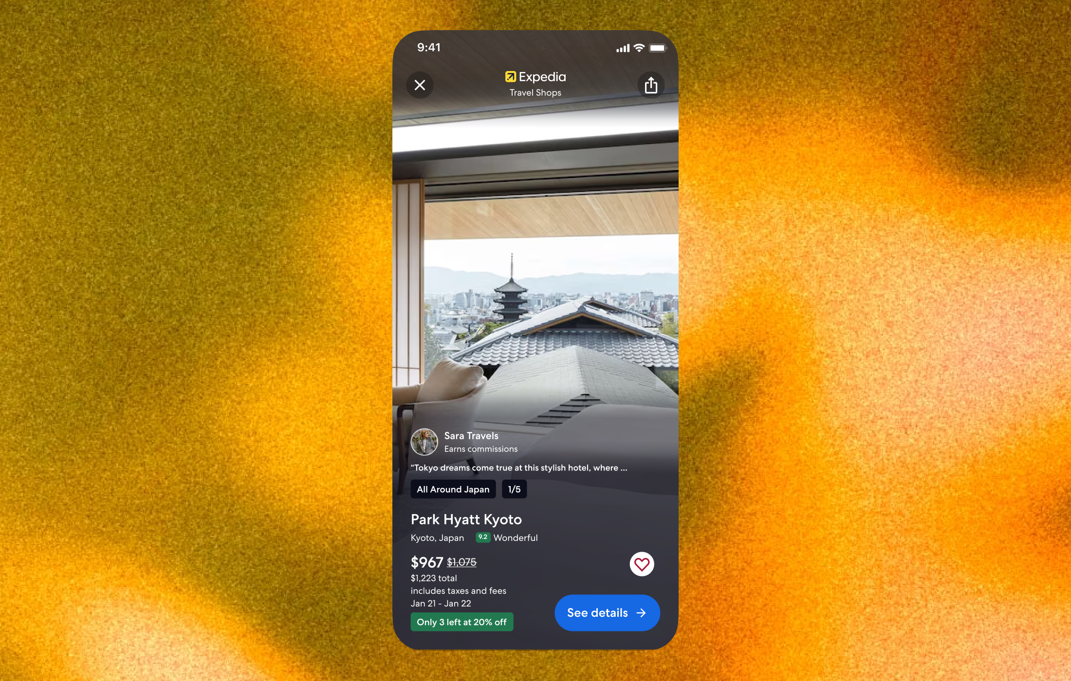
The immersive view
The immersive view was designed to provide the same frictionless discovery experience travellers would expect when browsing travel content on Instagram. Tapping a collection from the shop page would open it full-screen, where travellers could see each hotel in full. To navigate between stays, travellers could tap the left and right sides of the screen to move back and forth.
The commerce overlay
The tension was keeping the social, browsing feel while giving travellers enough information to actually evaluate a hotel. Going too minimal made it beautiful but useless for booking. I landed on name, location, rating, and price, with a clear path to more detail if they wanted it.
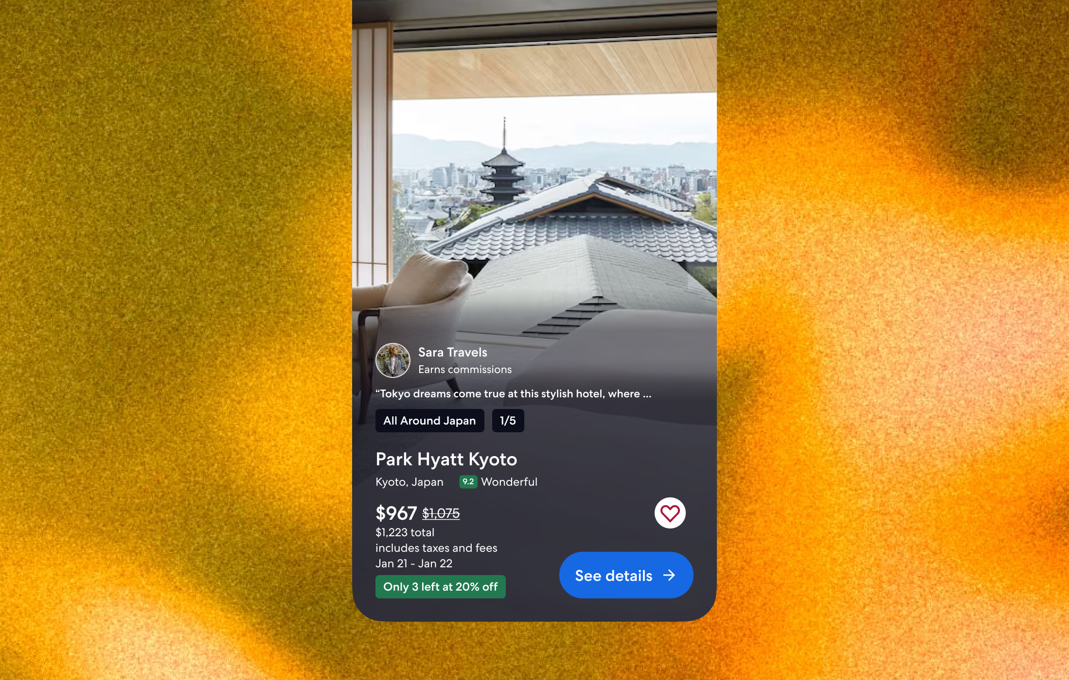
Actions
I introduced actions into each recommendation to help travellers move from discovery to booking. Travellers could bookmark a stay to save it to their Expedia profile, or preview more details on the product description page.
Frontend development
I was also the Software Engineer responsible for the Collections feature, built in React, TypeScript, and GraphQL. This covered the component architecture, state management, and API integration with our backend services. As the product was in active iteration, I structured the feature with a modular architecture so individual elements could be swapped in or out as new findings came through research, without rebuilding the surrounding structure.
Results
Feedback from Creators
"Travel Shops enables me to not only share, but also show my favorite hotels, destinations and experiences all in one place. This is both an excellent and efficient way to connect with my audience while helping them curate their own memorable travel journeys."
"I love how quick and easy it is for me to share travel recommendations with my personalized Travel Shop. Expedia absolutely crushed it when designing such a user-friendly interface."
Favourite Shops and Press Releases
Shops: Nom Life Travel Guides, Where to Find Me, Press: Rolling Stone, Variety
Learnings
Frictionless workflows matter as much as the end product
Creators are producing content constantly, and any tool that added steps or slowed them down would simply go unused. We learned early that the quality of a creator's shop was directly tied to how easy it was to build and maintain. This pushed us to treat the creator-facing workflows with the same design attention as the traveller experience, simplifying collection management, reducing the friction around adding hotels, and making sharing feel immediate.
Social platforms are designed to keep people in
One of the harder challenges was that social platforms actively work against outbound clicks. Travellers discovering a shop through a creator's Instagram story or TikTok were only a tap away from getting pulled back into the feed. We had to be deliberate about reducing the drop-off between that initial discovery moment and completing a booking on Expedia, making the path feel short, and ensuring the shop experience was compelling enough to hold attention once they arrived.