
Background
The Paid Socials team at Expedia Group ran an A/B test on Meta ads comparing creator-made hotel videos against static brand images for ad creative. Creator videos drove 180% more engagement and roughly doubled return on ad spend. No surprises here, travellers trust people over brands. Our team had sourced creator videos via the Creator Video Program; the question was whether we could surface them within the Expedia shopping experience.
Problem
The Expedia shopping experience relied on branded editorial content like articles and guides curated by in-house teams. Although informative, it lacked social proof from real travellers, and recommendations were more generic to cater to most audiences. Finding a hotel meant reading descriptions, scanning reviews, scrolling through photos. On social platforms, travellers watched a 30-second video to understand the details of a recommended stay.
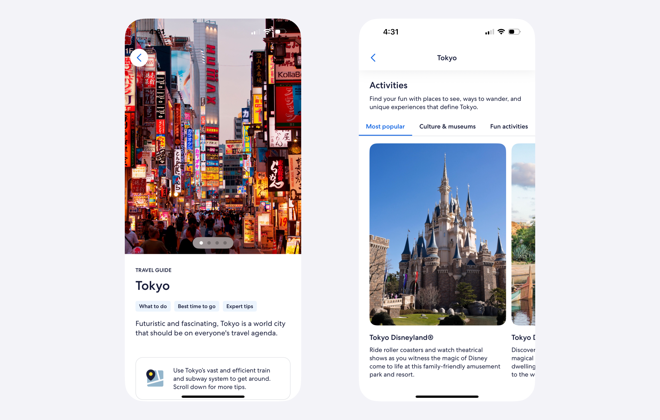
The opportunity was to surface creator videos within the shopping experience so travellers could evaluate properties with less friction and book with more confidence. I designed a universal video component to do this, bringing the familiar, low-effort browsing behaviour from social platforms onto Expedia.
Research
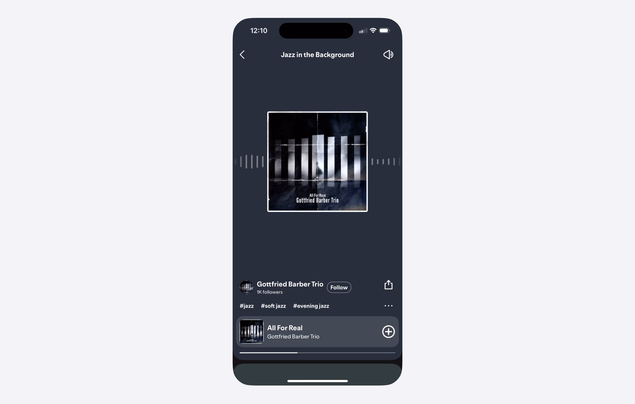
I conducted a competitive analysis of Instagram, YouTube Shorts, and non-social platforms like Spotify, that were using short-form content to help people discover new topics. Each brand converged on a single pattern: a scrollable carousel of video cards as the main entry point, and tapping on a card transitioned into a full-screen view of the video with a contextual information overlay.
Where the platforms differed was what went inside the overlay. A user sampling a song within Spotify's playlist previewer would be given a short clip to listen to, artist info and ways to control music playback. This set the direction for our design: what did this component need to do differently for a traveller who was looking for their next place to stay?
Wireframes
The entry point
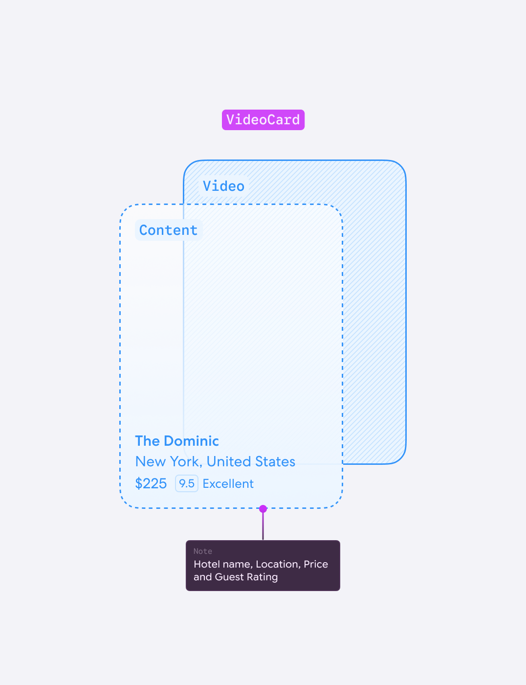
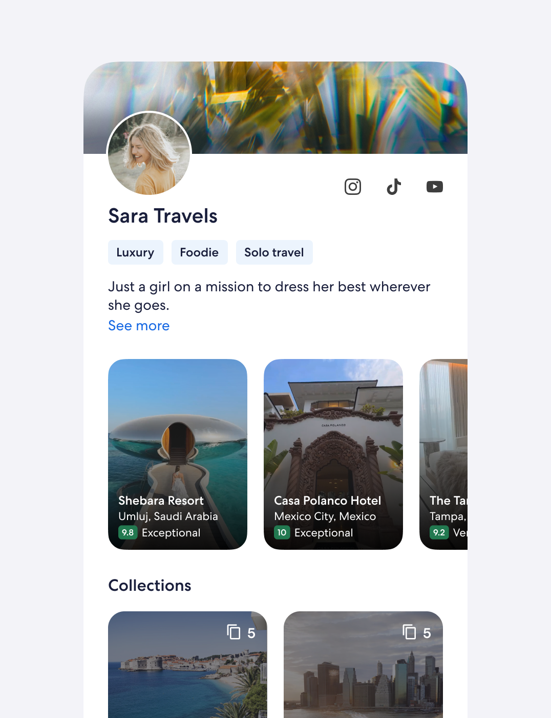
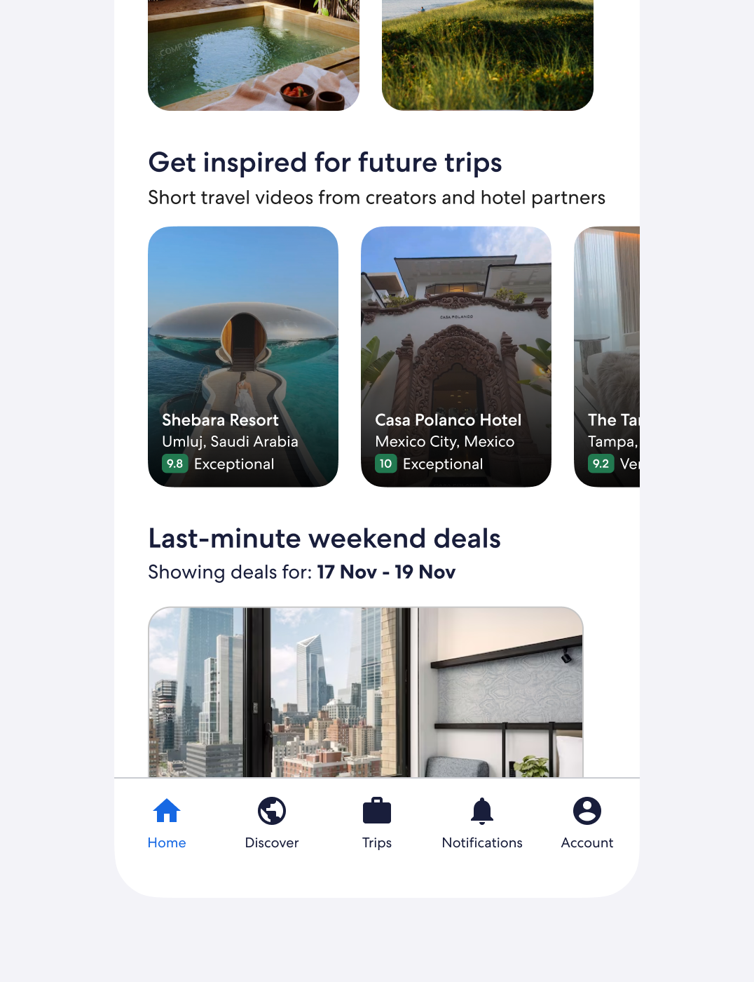
When a traveller came across the videos, it had to immediately communicate that this was a tool where they could discover stays recommended by creators. We utilised the same carousel pattern, with a short snippet of autoplaying video to trigger that familiarity. To help travellers evaluate if the content was relevant, hotel information like the property name, the location, and a review score was also included on each card.
The immersive view
One of the core tensions we had to solve for the immersive view was to keep the spirit of frictionless discovery while surfacing enough information for a traveller to decide whether the stay was right for them. We borrowed the same structural and gesture-based patterns from existing platforms to help travellers adopt the product, but also introduced some new concepts to assist with the hotel discovery experience.
Leveraging existing patterns
Rather than introducing new interactions and re-educating travellers, I incorporated existing interaction conventions like swiping vertically to reveal the next video and tapping to mute/unmute. This helped travellers focus on discovering their next stay.
Shoppable content
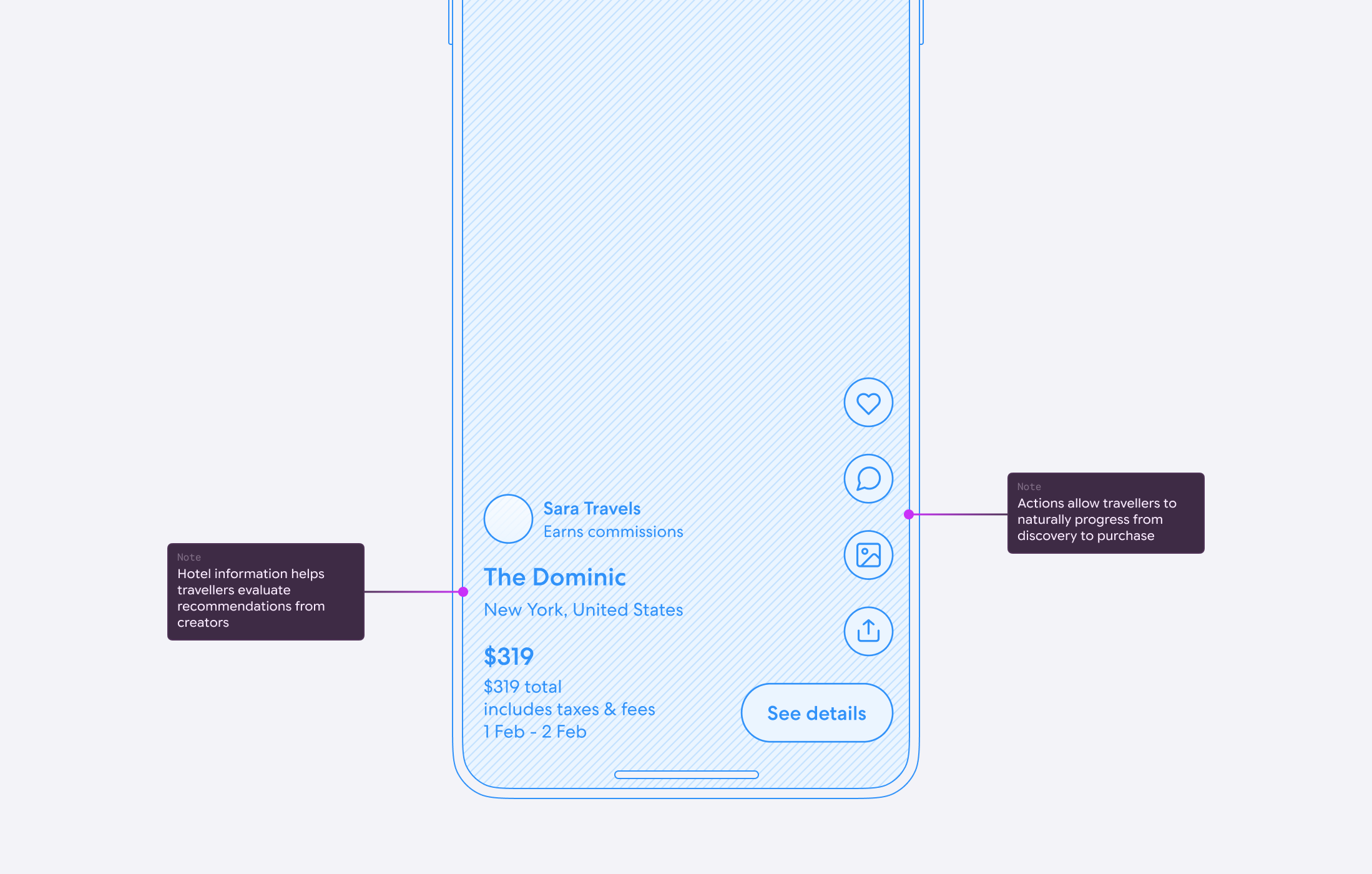
I wanted to give travellers information to help them move from discovery to purchase, but the overlay had to provide enough information without taking up screen real estate. We prioritised the hotel name, the location, the review rating, the price, and the creator name, providing just the right amount for a traveller to read more or swipe along.
Progressive disclosure
In the discovery phase, travellers want to build a clear mental picture of a place they have never been to. I included additional hotel photos and guest reviews to help with this, and introduced a bottom sheet to present them without taking travellers outside of the experience.
Path to purchase
I added actions as a natural progression towards making a booking. A traveller can save the stay for later, see more details about the hotel on the product description page (PDP), or even share the video with someone.
Design
The video component turned hotel discovery into an inspiring and seamless shopping experience. By leveraging existing design patterns, keeping interactions simple, and showcasing the creator's content, I helped travellers move towards purchase intent in a way that felt more natural to how they discover and book a stay.
Discover
Travellers can move directly into discovery from the page.
Evaluate
Travellers can gauge what stay is right for them at a glance, and find out more within the experience.
Decide
The traveller can save the stay for later or check availability. They can also share with a friend for a second opinion.
Accessibility
New components introduced to Expedia Group's design system required a minimum WCAG AA rating to ensure travellers of all abilities had equal access. Interactions with videos and carousels required single-touch pointer elements that were visible on screen. Travellers could navigate through videos and control playback and sound through visible on-screen controls when enabled from the component settings menu.
Distribution
The creator video component launched on Home and Travel Shops, where travellers were in discovery mode. The next step was expanding into Search Results and Product Description Pages, where the challenge shifted to how creator videos could support travellers who were closer to booking.
Results
The creator video component didn't reach statistical significance to say that it outperformed existing editorial content on the Home page on click-throughs. Within the component itself, travellers scrolled through videos but only a small group used the save or share actions.
Learnings
We believed the gap was a destination mismatch with travellers, where the videos on offer didn't align with where travellers wanted to go. The findings shifted the next conversation from design to content: how to source and match creator content to where travellers actually wanted to go.